Shape Letters With Ink
Practice calligraphy from the first basic strokes to short written phrases, with careful attention to pressure, spacing, slant, and page control.
Build A Steadier Hand
InkVista keeps early practice focused on strokes, guidelines, pressure changes, and readable letterforms.
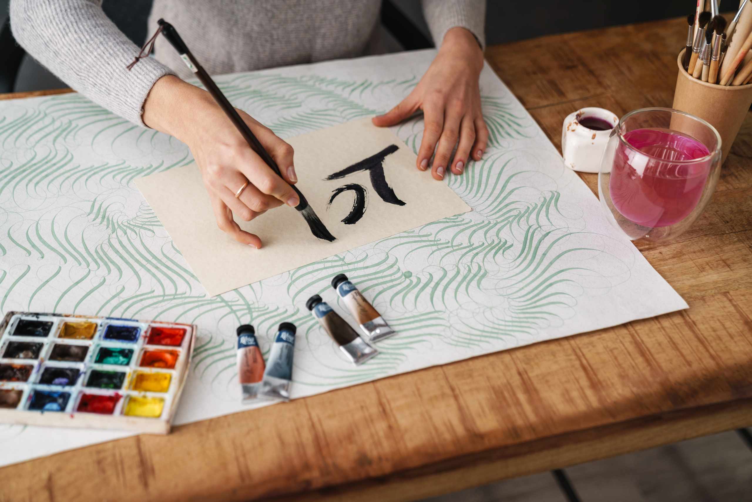
Basic Strokes
Repeat upstrokes, downstrokes, ovals, loops, entry strokes, and exit strokes before rushing into full alphabet pages.

Pressure Control
Learn how lighter upstrokes and firmer downstrokes create clearer contrast without squeezing the pen too tightly.
Spacing And Slant
Use baselines, x-height, and simple spacing checks so short words stay readable and letters stop drifting.
Calligraphy Practice With Clear Checks
Guidelines First
Light pencil lines help control baseline, x-height, ascenders, and descenders before decoration is added.
Slow Stroke Rows
Short rows of repeated strokes make pressure changes easier to notice than full pages of rushed letters.
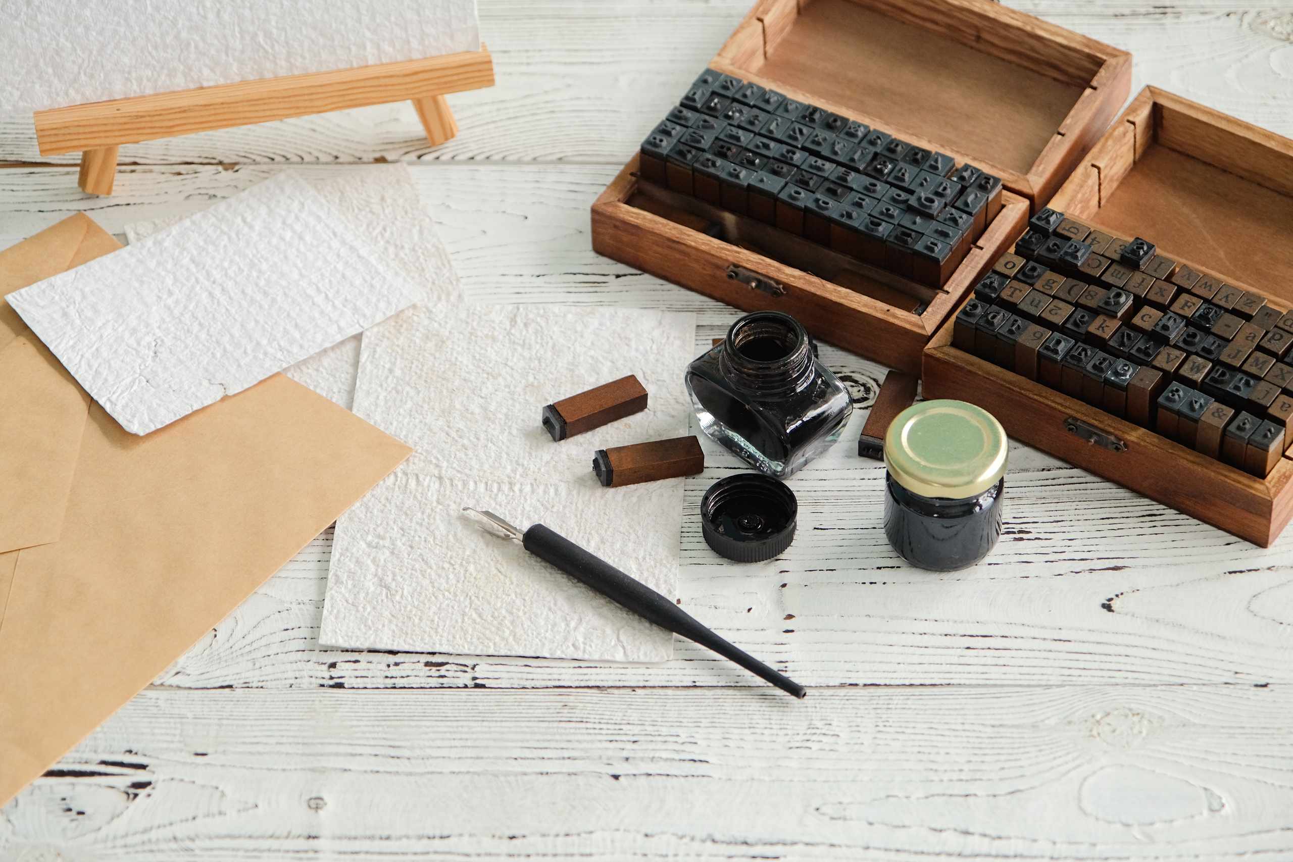
Simple Tool Choices
Brush pens, smooth paper, tracing sheets, and basic ink supplies are explained without pushing a large kit.
Word Practice
Short words and phrases are reviewed for spacing, slant, joins, and ink flow one visible issue at a time.
What Learners Notice
I stopped trying to copy whole alphabet pages and began seeing how each letter starts with smaller strokes. My spacing checks feel much clearer now.
The pressure exercises helped me understand why my upstrokes looked heavy. Slowing down after each downstroke made practice less messy.
Using guidelines for baseline and x-height made my short words easier to read. I also learned which smooth practice paper worked better with my brush pen.
Calligraphy Notes And Tips
What To Look For In Beginner Calligraphy Paper (And What To Avoid!)
The pen may not always be the reason a line looks jagged or inconsistent. A brush pen may…
Read More
How to Use Guidelines Without Making Practice Feel Rigid
Before the pen even touches the page, the guideline sheet can look forbidding: baseline, x-height, ascender space, sometimes…
Read More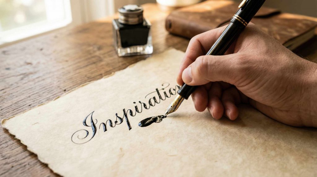
Why Thin Upstrokes And Thick Downstrokes Feel Uneven At First
The reason why thin upstrokes and thick downstrokes seem awkward is because this requires your hand to produce…
Read More